


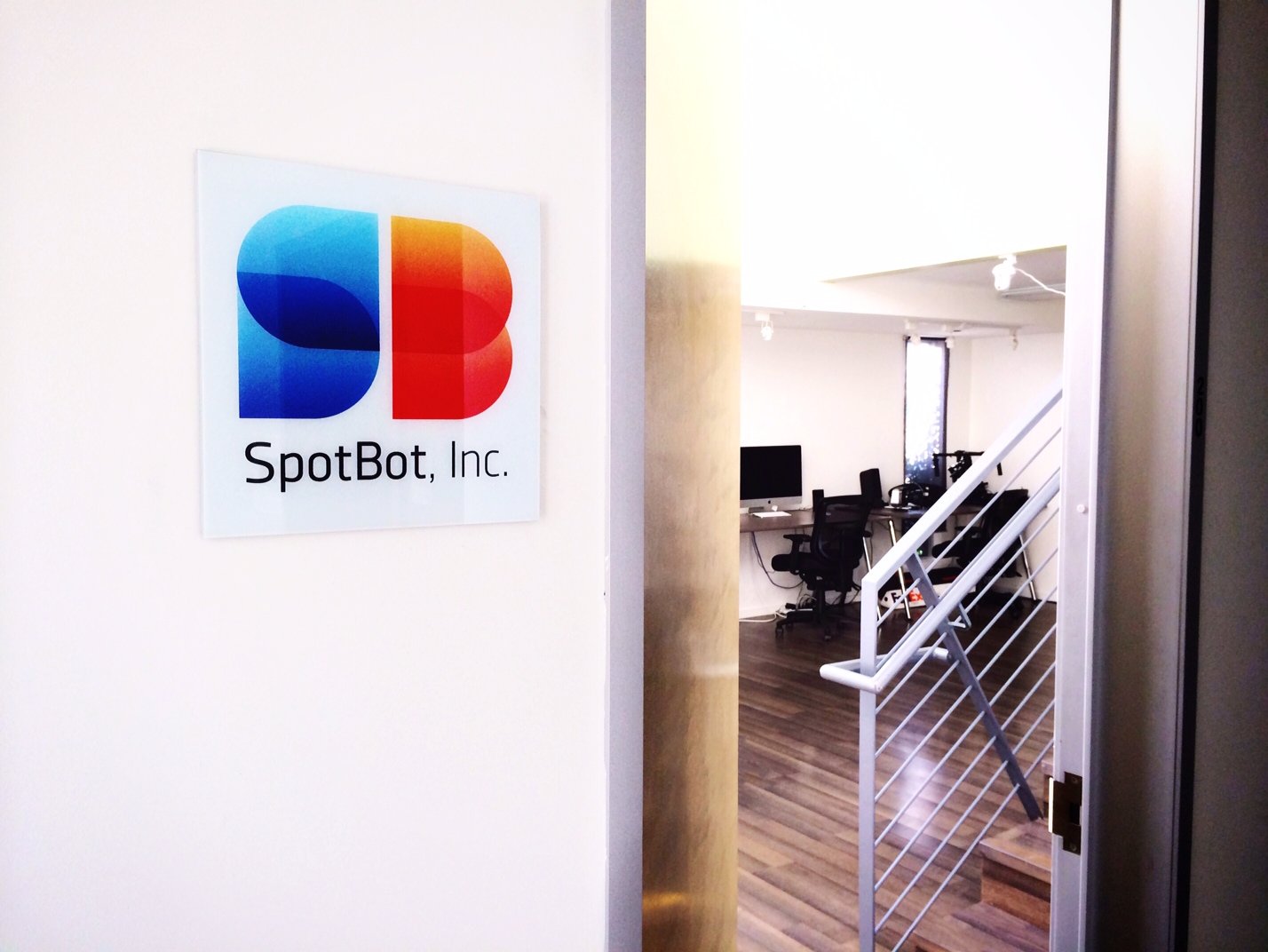
When a post production company that I worked closely with approached me to rebrand them, I was excited to help. I built SpotBot, Inc. a modular brand identity that they could apply to still or moving assets seamlessly, either in full color or a striking black and white.